From color that turns to mud to a palette that dries out, here’s the plain-English fix for 17 common slip-ups, straight from working painters and teachers.
The best fix in the bunch comes from Leonardo da Vinci’s notebooks, and it’s waiting at #1.
The rinse water in the jam jar has gone the color of a creek after a storm, and so has your sky. You wiped it, added a little blue, wiped it again. Now there’s a soft gray hole where the morning was supposed to be. Mud like that, and nearly every other beginner painting mistake, has a name, a cause and a fix teachers hand out all the time. Most of the fixes are already on your table.
#17 Blending colors into mud
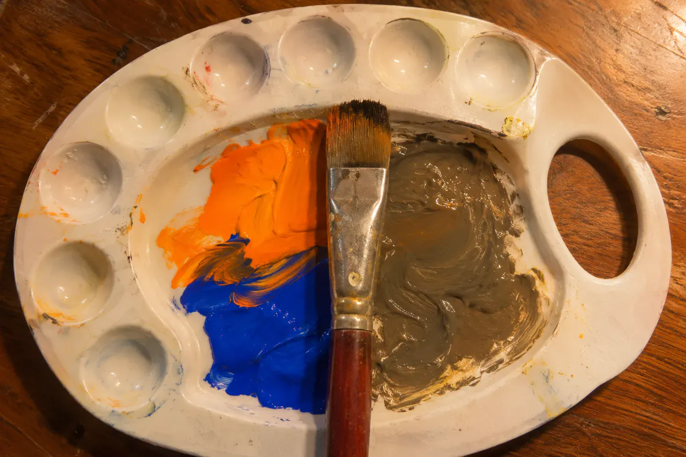
You know how it goes. The orange was bright, so you warmed it a little, then cooled it, then darkened it a touch. Now the puddle on your palette is the color of a paper grocery sack left out in the rain.
Count what’s in that puddle. A watercolor maker’s teaching page draws the line plainly: “Mixing two colors usually gives you something beautiful. Mixing three starts to get complicated. Mixing four or more almost always produces a grayish brown.” (Peerless Color Labs)
The sneakiest way over that line is a pair of opposites on the color wheel, like orange and blue or red and green. Artist Janne Lee explains why. Between them, a pair like that holds all three primaries, and “When you mix all three primary colors together you will get neutral colors, aka MUD!” Her fix is to mix neighbors on the wheel instead, say yellow into orange, and keep the opposites for times you want a quiet, dulled shadow on purpose.
Then look at your rinse water. Peerless names it as one of five everyday causes of mud. The others are too many colors in one mix, stirring wet paint too long, painting over a layer that isn’t dry, and colors whose hidden warm or cool leanings fight each other. A clean brush dipped in murky water, they write, “is a direct path to mud. This is why keeping two water containers is worth it.”
Is a muddy mix worth rescuing? On the palette, no. Scrape it off and start again with two colors. That costs you a dab of paint.
Then fish a second jar out of the recycling bin. One gets dirty. The other stays clear, for wetting your brush and thinning paint.
#16 Fiddling with one spot too long
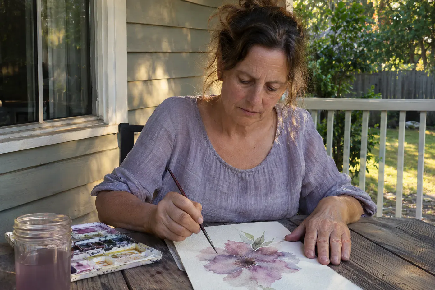
That one petal. You’ve gone back to it five times, and every visit made it a little less like a petal and a little more like a bruise.
Watercolor artist and teacher Louise De Masi gives a stopping rule short enough to tape to the lamp: “Put the paint on the paper and leave it alone.”
“The best brushstroke you can make is the one you decide not to make.” Louise De Masi, watercolor artist and teacher (her stopping rule)
Overworking hurts the two paints in different ways, and knowing which one you’re holding tells you how worried to be.
In watercolor, the layer under your brush can still move. “If you paint over a layer that is still damp, you can disturb the paint underneath,” De Masi writes. Every extra pass stirs up the color you already liked, and stirring wet paint leaves it, in Peerless’s words, “flat and dull.”
Acrylic dries to a skin you can paint right over. An overworked acrylic patch is annoying. An overworked watercolor patch is often permanent.
So if you’re painting in acrylic, give the fussy spot one more try once it’s dry. If you’re in watercolor, the brave move is to lay the brush down while you still like what you see.
#15 Too much water, two different results
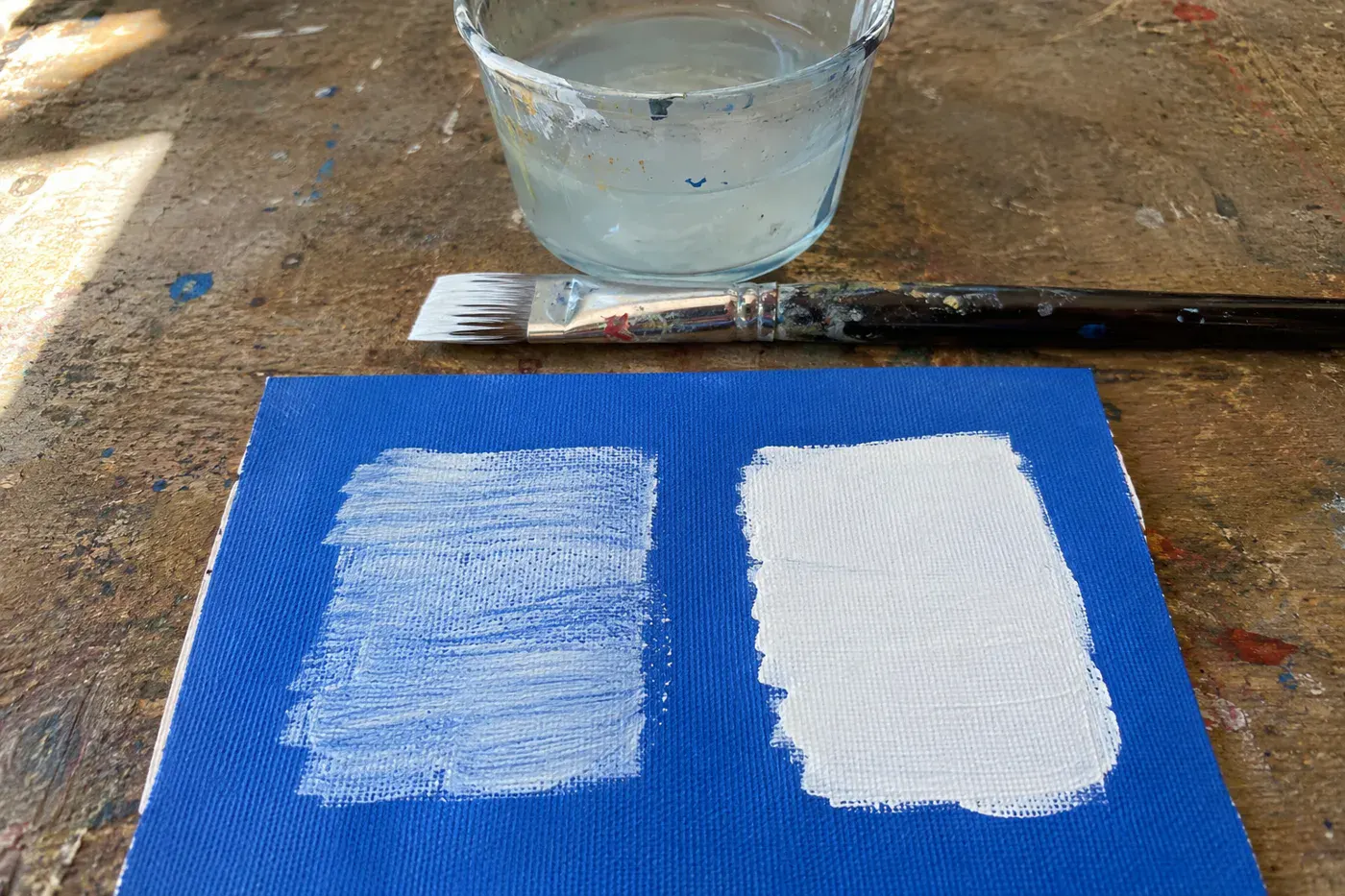
The habit is the same in both paints: one generous dunk in the jar, and on goes the brush. What it does to each paint is different.
In acrylic, too much water turns paint see-through. That streaky white that still shows the blue underneath after the second coat is the clue. The more white acrylic is thinned, the more translucent it gets, so you need more layers. Use less water and the paint covers better.
Wildlife artist Daniel Wilson of Studio Wildlife, whose work is collected internationally, says he sees it constantly: “I see a lot of beginners using a lot of water when they’re mixing acrylic paints.” His fix costs nothing: “Dip the very tip of your paint brush into your water pot rather than dipping in the whole brush.”
In watercolor, water is the paint’s whole personality. So the question is how much. Watercolorist Joseph Zbukvic made a kitchen scale popular for this, and painter Erika Lancaster puts rough ratios to it. If everything you paint looks like weak tea, that’s because it is.
Water, by feel – Tea: about 90% water and 10% paint. Coffee: about 70% water and 30% paint. – Milk: about half and half. – Cream: about 30% water. Butter: about 10% water, nearly all paint. – These are “about” figures. Brush each on scrap paper before it goes near your painting.
If you want a pale, see-through acrylic layer on purpose, go ahead and thin it. Just don’t expect thinned paint to cover anything.
#14 Leaving your brush standing in water
The phone rings. You drop the brush into the jar and go. An hour later the tip has a hook in it like a crochet hook, and it won’t straighten on its own.
Princeton Brush Company, which makes brushes, spells out the two rules that night broke. “Never leave a brush soaking in water or mineral spirits for an extended period of time.” And: “Never let your brush rest on its head.”
There’s a quieter kind of damage, too. The ferrule is the metal collar that holds the bristles. When paint creeps up into it and dries, it’s hard to get out. Princeton’s warning: “Do not immerse the brush in paint up to the ferrule.” That’s why an old brush can feel stiff and fat at the base even after you’ve rinsed it.
The fix takes about a minute:
- Rinse until the water runs clear, as Winsor & Newton describes. Princeton Brush adds that watercolor and acrylic brushes should be cleaned with mild soap and water.
- Squeeze out the extra water and reshape the hairs with your fingers.
- Stand it upright on its handle, bristles up, so the ferrule dries too.
A coffee mug that’s lost its saucer does the job. Bristles to the ceiling.
Already have a hooked one? If it’s synthetic, brush maker Rosemary & Co says it can often be rescued. Carefully pour boiling water into a cup and dip just the brush head for 30 seconds to a minute. Reshape it with your fingers and let it dry on its own.
#13 Scrubbing instead of lifting a mistake
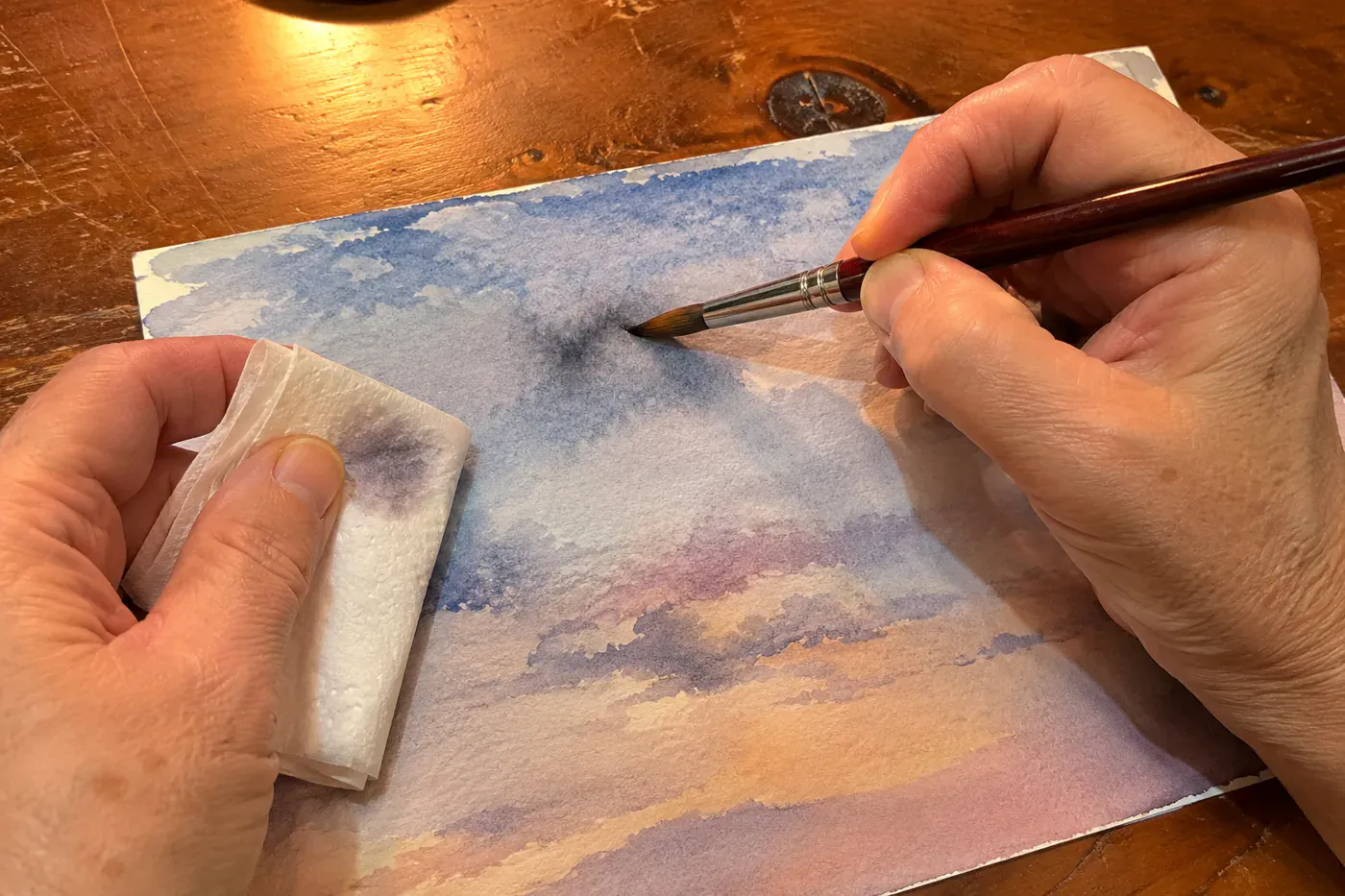
There’s a dark blot in your sky, and every instinct says to grab a wet paper towel and rub. Rubbing pushes wet paint deeper and wider. Teachers lift it instead, and usually after it dries.
Here’s the part most people never hear. Whether a color lifts depends on the pigment. Winsor & Newton explains that non-staining colors “remain on the paper’s surface as the water evaporates, making them easier to lift once dry.” Staining colors “absorb into the paper and are more resistant to removal.”
Their examples of the easy-lifting kind are Cadmium Orange, Quinacridone Red, Ultramarine Green Shade and Burnt Sienna. For those, they suggest a soft, damp brush or cloth, and a sponge for bigger areas.
So when a blot lands, let it dry before you touch it, then lift it gently. If it’s a staining color, it may not come up at all, and you’re better off leaving it alone.
#12 A painting that’s all one gray
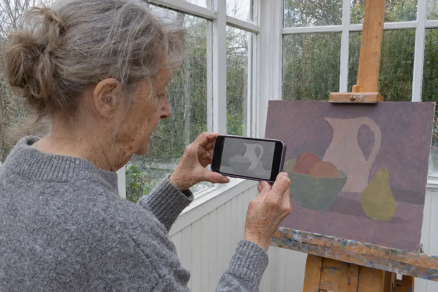
The colors are pretty. The painting is flat anyway, like a photo taken on an overcast day.
That’s value, meaning how light or dark something is, with the color set aside. Artist Lori McNee puts it in one line: “color attracts the eye, but value gives the painting its structure.” When all your values sit in the middle, the color can’t hold the picture up.
Squint at it. McNee says squinting “removes detail, reduces color information, and makes the larger light and dark shapes easier to see.” Nature might show you eight to ten values, and she suggests grouping them into three or four. Landscape painter Mitchell Albala works in just two, three or four in his early studies.
Then let the phone do the squinting for you. Take a picture of the painting and turn it into a grayscale photo:
- On an iPhone, open the picture in Photos, tap Edit, then choose a filter. Apple names Mono and Silvertone as its black-and-white looks.
- On an Android phone, open the picture in Google Photos and tap Edit. Then choose Filters for a ready-made classic look, or choose Adjust and drag the Saturation slider all the way down.
If the gray version looks like fog, your darks aren’t dark enough or your lights aren’t light enough. In acrylic, push both in the next layer. In watercolor, you can always add darks. The lights have to be kept from the start, which is #9.
#11 Skipping the little thumbnail sketch
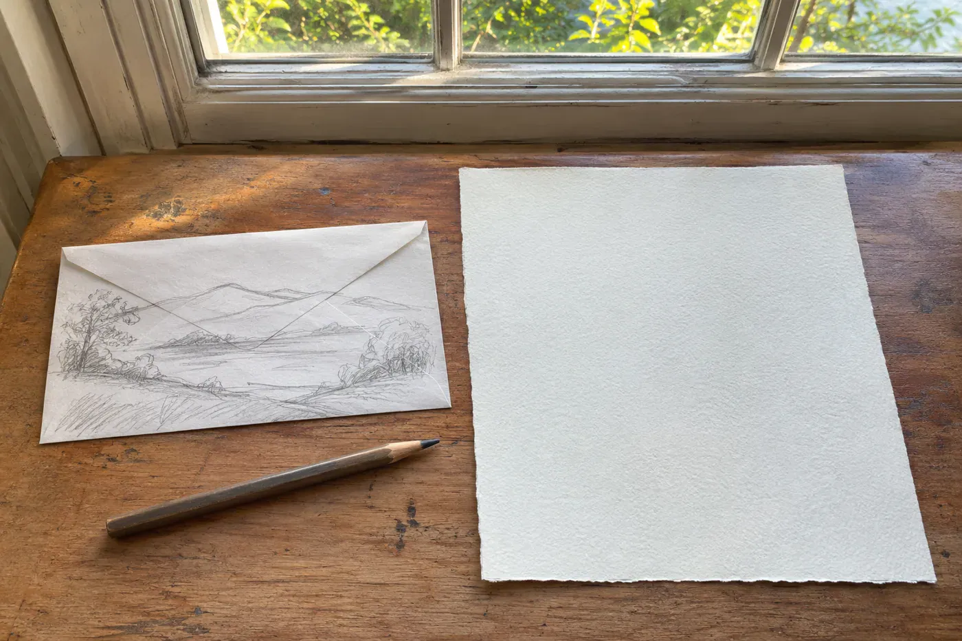
You’d never cut into good fabric before laying every pattern piece on it first. You check that it all fits, the grain runs right, and the stripe lines up across the front. A thumbnail sketch is that same layout check for a painting, and it takes less time than pinning a pattern.
Mitchell Albala, who wrote the book Landscape Painting, is firm about keeping it small: “Keep thumbnails or preparatory studies very small. Larger studies take up too much time.” He uses “a broad, bold tool,” so you can’t fuss over detail even if you try. His rule: “Composition first, color second.“
Lori McNee’s order of work makes a good routine. Photograph your subject, turn the photo black and white, squint to find the big light and dark shapes, make a small sketch in three or four values, then paint. That small sketch in values is what teachers mean by a value study.
The back of an envelope is plenty. If the little sketch looks lopsided or crowded, the big painting would have too, and you found out before you mixed a drop of paint.
Who can skip it? If you paint loose and quick for the fun of it, you can. If you’ve lost more than one painting to a layout that felt wrong halfway through, this is your fix.
#10 No clear spot for the eye to land
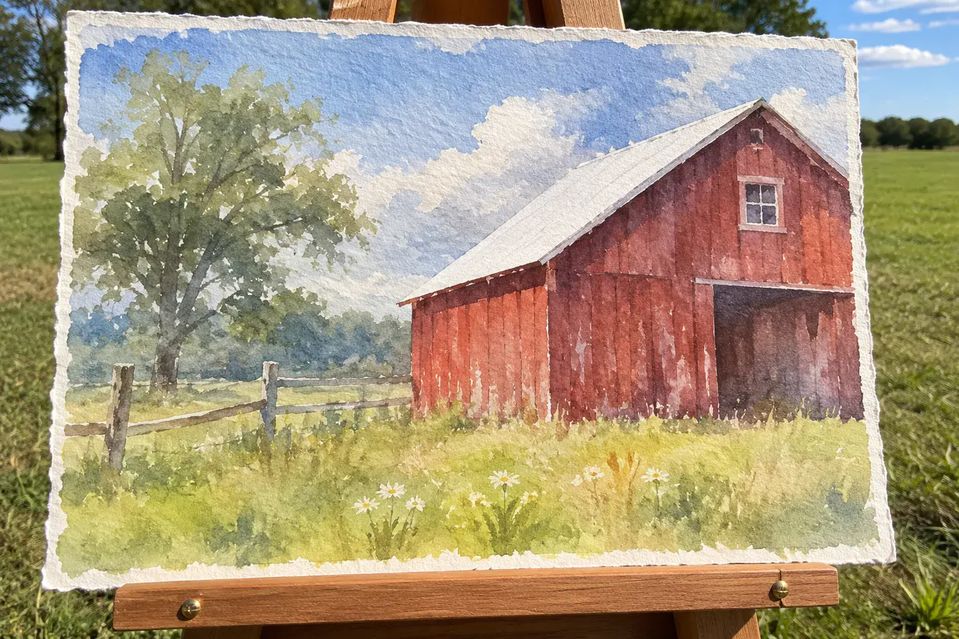
“Add a focal point” is advice so vague it’s nearly useless. Watercolor teacher and author Jenna Rainey turns it into tests you can check with a fingertip.
Start with her planning question: “What do I want people to notice first?” Then check your painting against her three tests:
- Where is the lightest light touching the darkest dark? Rainey: “Place your lightest light next to your darkest dark.”
- Where are the sharpest edges? “Add your sharpest edges and finest details right at the focal point. Keep everything else softer and looser.”
- Where is the brightest, purest color? It belongs at the focal point too, slightly off-center.
Here’s what usually happens when you check. You find two or three spots tied for strongest contrast: the barn, the tree and the fence post all shouting at once. That’s why your eye keeps wandering.
Pick the winner. In the others, soften one edge or nudge the dark a shade lighter. One crisp edge in the whole painting does more than a dozen.
#9 Painting over your watercolor whites
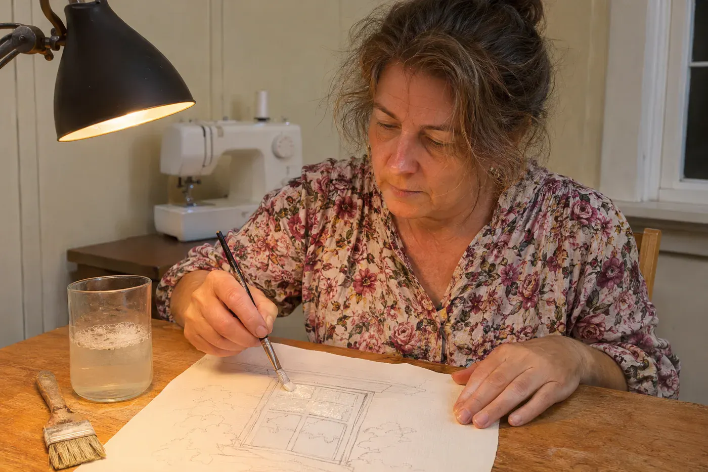
The sparkle on the water, the light in a window, a white cat’s whiskers. In watercolor those are usually bare paper, and once a wash goes over them, they’re gone.
Andy Griffiths, the watercolorist behind Solving Watercolour, gives the rule: “you need to paint from the lightest to the darkest tones as you can’t paint light over dark like you can with Gouache or oils.” White paint over a wash rarely looks like the glow of paper.
The free fix is planning. Before the first wash, decide where your whites live and draw a faint pencil line around them. Then paint around them. A thumbnail from #11 makes this easy, because the whites show up as the empty spots.
If you already have a bottle of masking fluid in the drawer, that’s the liquid you brush on to protect white paper and rub away once the paint is dry. Artist Ingrid Sanchez’s tips cover the things that go wrong:
- Use an old brush dipped in soapy water, about “a teaspoon of liquid soap in a glass of water,” so the fluid doesn’t wreck the bristles.
- Put it on fully dry paper, and take it off only from fully dry paper.
- “Don’t leave the masking fluid on for more than a week.”
- “Student grade paper and thin paper don’t react well to masking fluid.” It can tear when you pull the mask off.
Honest call: masking fluid is fine for a beginner on sturdy paper. On thin practice paper, a pencil line and a steady brush are safer.
#8 Calling your first layer a failure
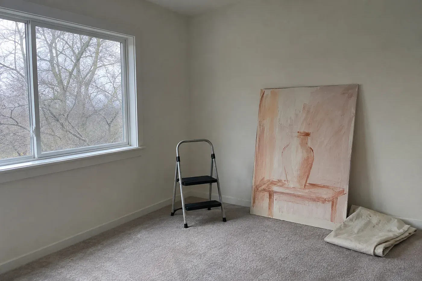
You cover the canvas, step back, and it looks like a child’s poster. Streaky, thin, the drawing showing through. So you put it face to the wall.
A painter on r/painting put it bluntly: “Unless you’re painting thick, the first layer is little more than a glorified underpainting, yet people will consider it a finished piece.“
An underpainting is the rough first layer that maps out the colors and darks so later layers have something to sit on. It’s supposed to look unfinished, the way a dress on the dress form looks nothing like itself with only the basting in.
The coverage math is stricter than most people expect. “One coat of white acrylic is generally not opaque enough to thoroughly cover any color underneath it,” Art is Fun explains, “so you’ll need to paint sometimes two or three coats.” Some colors cover better than others: cadmiums hide what’s under them better than quinacridones do.
Watercolor artist Anna Mason has a name for that awkward middle. She calls it the “ugly duckling stage,” and she says not to judge a painting while it’s in it.
Turn the canvas back around. It’s waiting for its second coat.
#7 Painting the cat you remember
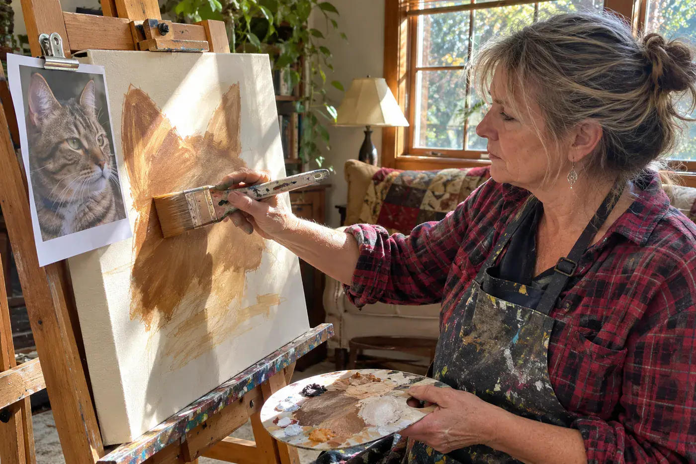
You set out to paint the cat in the photo. What lands on the paper is the cat in your head: almond eyes, two triangle ears, whiskers like a drawn sun. Your cat’s actual face is lopsided and much more interesting.
Artist Dan Johnson describes the habit: “As children, we all form symbols in our minds to help us easily identify objects, e.g. the sky is blue, eyes are almond shaped, snow is white etc.” Your hand paints the symbol faster than your eye can check the reference photo.
The best-known cure is to turn the photo upside down. Betty Edwards made it famous in Drawing on the Right Side of the Brain, first published in 1979, which became a standard text in many art schools. The usual version has you copy a Picasso portrait turned on its head, so your brain can’t name what it’s looking at.
It’s hugely popular. It may not work. In a 2010 study, students who drew faces upside down did worse at getting the spacing and proportions right, and their accuracy didn’t improve.
The fix with better footing is to block in simple shapes first. Paul Rubens, an art-supply brand’s teaching blog, describes flat blocking: put down the big shapes in simple, solid color with “a larger flat brush than feels comfortable.” A big brush can’t paint whiskers, which is the point. Their order of work is “broad to narrow, wet to dry, soft to sharp.”
Whether it’s a cat or a coffee mug, squint at the photo and paint the big dark shape of the head before you think about eyes. The eyes will land in the right place because the head is already there.
#6 Distant hills as bright as the foreground
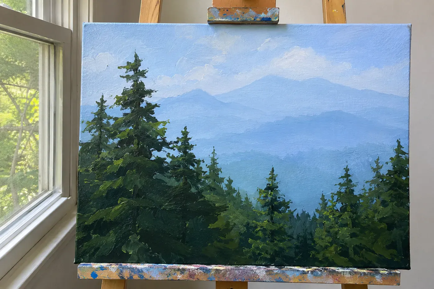
Your faraway mountains are as green and crisp as the bush by the porch steps, and the whole scene stands up flat like a stage set. It’s one of the questions painters ask most about landscapes, and the fix has a museum name.
The National Gallery in London calls it aerial or atmospheric perspective: as land stretches away from you, the air changes its colors and tones. The Gallery traces it in paintings back to the early 1400s in the Netherlands, so painters have been using this trick for about 600 years. Tate adds the color clue: the atmosphere looks more blue in the distance.
Will Kemp turns that into a practical guide for painting mountains:
- Everything gets lighter in value as it recedes.
- The dark tones change the most. Your far hill’s shadows should be nowhere near as dark as the shadows up front.
- Blur the farthest mountain “more than you would initially think and the viewer will ‘create’ the mountain in their mind.”
- Pure whites, like snow on a far peak, hold their lightness at a distance.
That third point is the one people get wrong. Nobody blurs enough the first time. If the far ridge still looks sharp in your phone’s black-and-white photo, soften it again.
#5 Reaching for black to paint shadows
The shadow under the apple went on with a little black, and now the apple looks like it’s sitting on a hole in the table.
Jenna Rainey says black makes shadows look “dull or muddy.” She mixes them from blues, purples, browns and the color’s opposite on the wheel. That’s exactly where Janne Lee’s advice from #17 pays off: opposites make mud in the light and beautiful shadows on purpose.
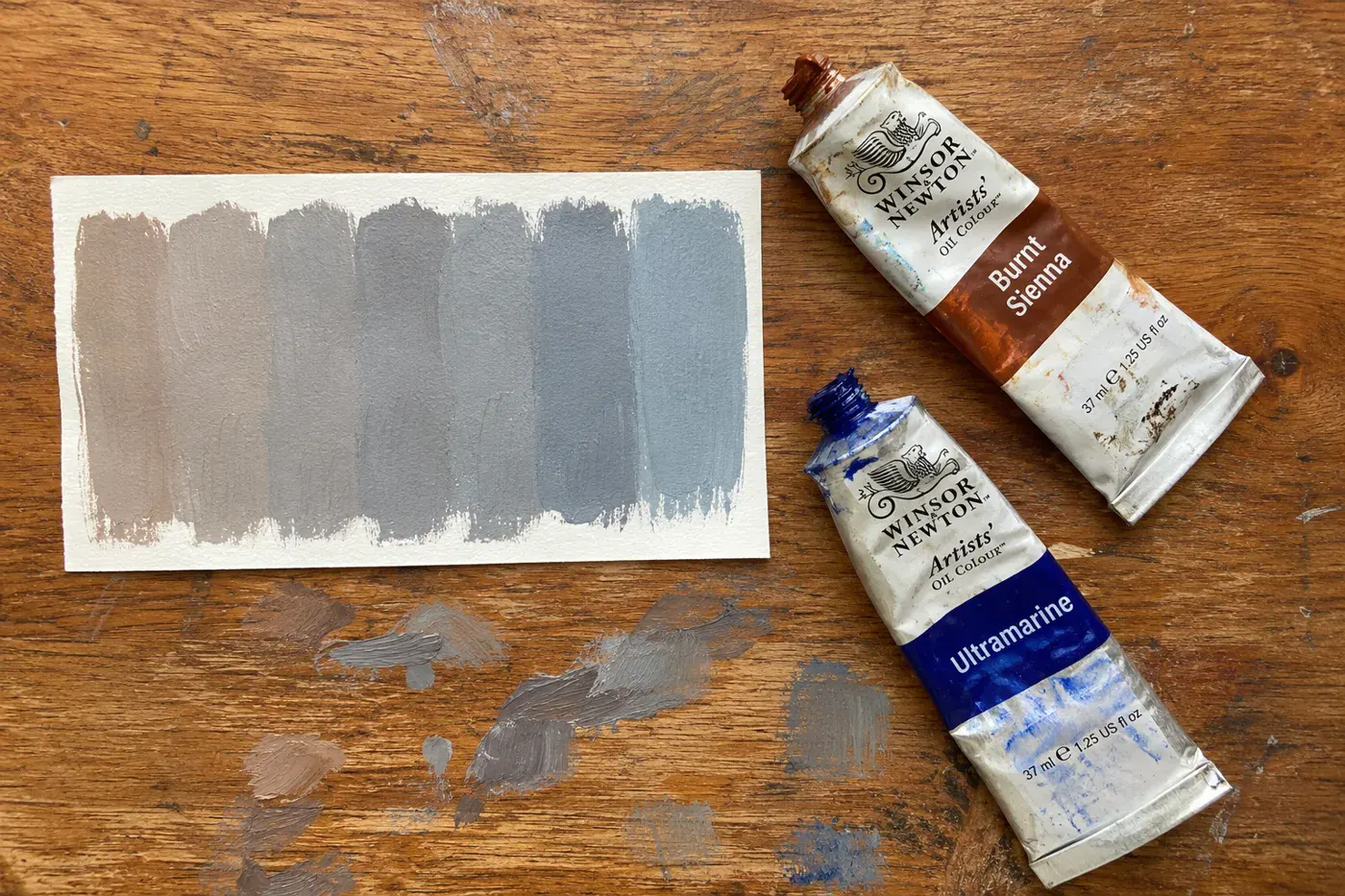
For watercolor grays, artist Jane Blundell skips black, which she says will dull your painting. She mixes Burnt Sienna with Ultramarine, two tubes many painters already own, and gets a whole range of grays from that one pair.
Rainey’s other rule is the one that makes shadows look real:
“Warm light creates cool shadows; Cool light creates warm shadows.”
So a sunny yellow afternoon gets cool shadows, and a cold window light gets warm shadows. Paint a little swatch of each beside your apple and see which one looks like the room it’s sitting in.
#4 Adding new watercolor before it’s dry
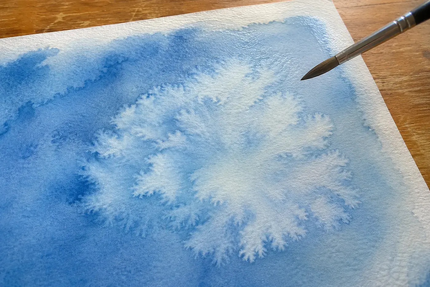
It looked dry. You laid in the next color, and a pale, frilly ring bloomed out across the wash like a cauliflower. It has a name.
Peerless calls it a bloom: it happens “when wet paint is added to an area that is damp but not fully wet, and the new pigment pushes the old pigment outward to the drying edge.” The same thing causes color bleeding where you didn’t want it. Damp is the danger zone. Very wet paper and bone-dry paper are both safe.
The usual test, “the shine is gone,” is where people go wrong. Paul Rubens: “Surface shine is only the first clue.”
Is it dry enough to paint over? – Wet: it’s shiny, and the water moves when you tilt the paper. – Damp: “Shine is gone but paper feels cool or dark.” – Bone dry: “Paper color is back, no coolness, no shine, no tack.” – Only bone dry is safe for a new layer on top.
Peerless adds a test that won’t leave fingerprints: “Run the back of your hand near the paper without touching it. If you feel any coolness from evaporation, it is still damp.”
And if you catch a bloom as it starts? Andy Griffiths’ save: “Take a large dry (Thirsty) brush and brush into the forming cauliflower. The brush will suck up the excess water.” Squeeze your brush out on a towel first. It only works while the edge is still spreading, so keep a dry brush beside the jar for emergencies. Next time, let the wash dry before you paint over it.
#3 The color that dries isn’t the color you mixed
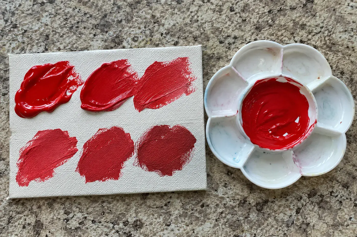
You matched the barn red perfectly. You came back after supper and it had turned into a different red, as if somebody swapped the tubes.
Acrylic painters complain about this in the comments under one TikTok painting video and on Reddit, and it isn’t your eyes. The two paints shift in opposite ways.
| Paint | What happens as it dries | Why |
|---|---|---|
| Acrylic | Dries darker | The binder is milky wet, clear dry |
| Watercolor | Dries duller, a little lighter | The color loses strength as water leaves |
Golden, which makes acrylics, explains the acrylic side: “When wet, a color will appear lighter in value, but once dry it will appear darker in value.” The milky-looking binder that holds the paint goes clear as it dries.
Watercolor is where the usual advice gets it a bit wrong, and it changes how you’d fix it. You’ll often read that it dries 20 to 30% lighter. De Masi gives that figure and notes it varies between pigments. But when Bruce MacEvoy measured dried watercolors with an instrument for his site handprint.com, lightness barely moved. What dropped was the color’s intensity, by nearly five times as much. In his words, “this loss of chroma is the main cause of the drying shift.”
So if your dried wash looks weak, adding water-thinned paint on top won’t bring it back. Mix a stronger, creamier wash next time.
Golden’s advice for acrylic is to mix colors and let a sample dry before applying it to your artwork. Louise De Masi recommends the same test-swatch habit for watercolor, since dried color can look different from what you mixed wet. Keep a scrap of the same paper or canvas beside you, dab each mix on it, and let it dry while you work somewhere else.
#2 Acrylic paint drying on your palette
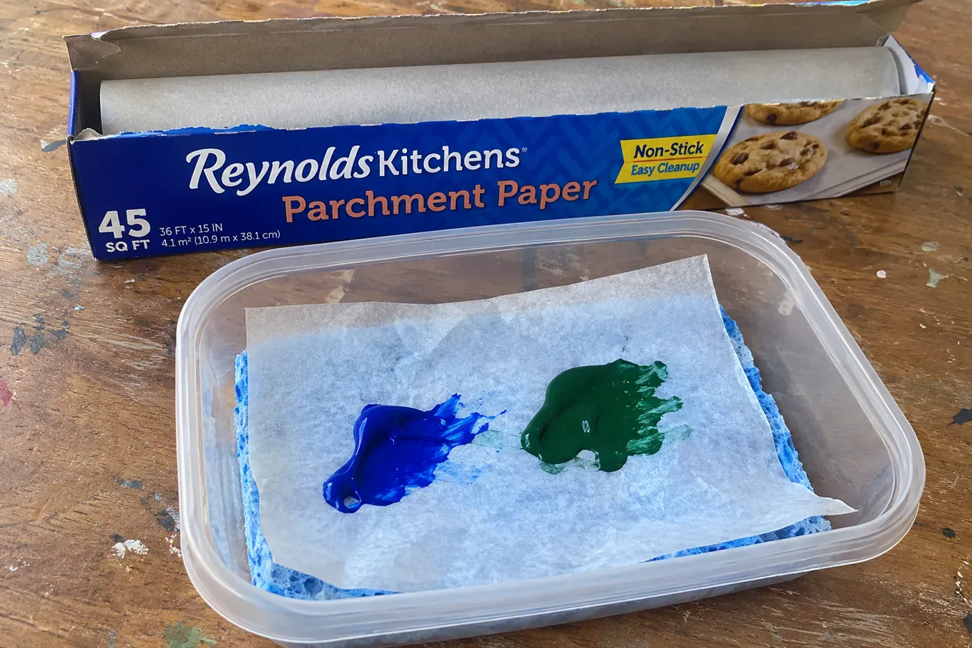
Acrylic on a palette can dry out quickly. The blue grows a skin, then turns into a plastic button you could pry off with a fingernail. It’s one of the acrylic painting mistakes people ask about most. Daniel Wilson of Studio Wildlife says the question reaches him all the time.
He admits he did it too: “Starting out myself, I used to just put tiny little blobs of paint on the palette.” It feels thrifty. It isn’t, because a tiny blob dries fast and you throw it away anyway.
Fixes with nothing to buy:
- Put out more. “If you put more paints on the palette, it will stay wet for longer.”
- Mist the palette with a spray bottle as you work. A clean plant mister is perfect.
- Taking a break? Mist it and cover it with plastic wrap. Wilson says that keeps paint usable for hours, sometimes days.
The homemade wet palette. If you paint acrylic often, this is the one to make. Gareth Branwyn’s recipe in Make: magazine came to about $6 in 2018, against $15 to $20 for a store-bought one:
- Get an airtight plastic container with a lid (he paid about $4 for a two-pack), a sponge cloth and a box of kitchen parchment.
- Boil the sponge cloth, then wring it out until it’s damp but not soaking, and lay it in the container.
- Soak a piece of parchment for 10 minutes and smooth it over the sponge.
- Squeeze your paint onto the parchment and snap on the lid between sessions.
One thing to get right: baking parchment, not wax paper. They sit side by side in the kitchen drawer, and the recipe specifically says not to use the wax kind.
#1 Deciding your painting is a failure the same night
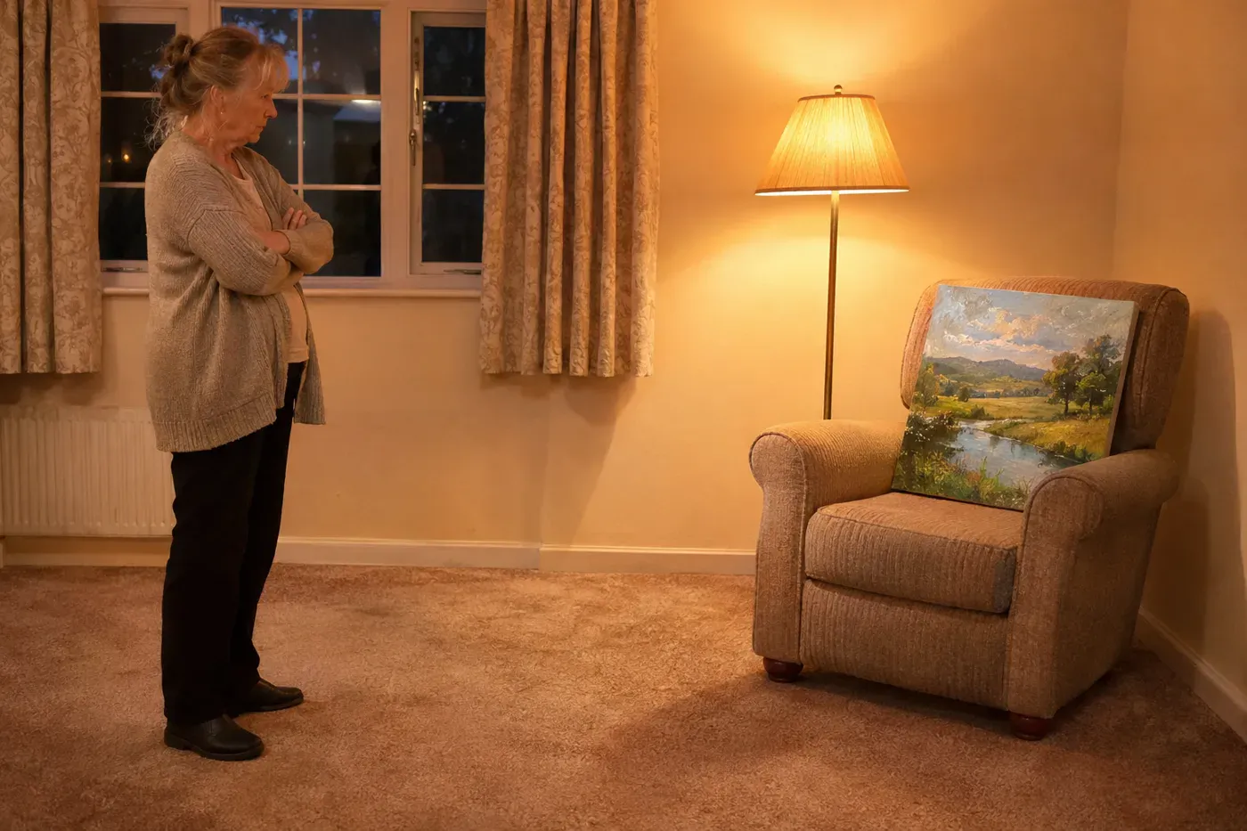
It’s late, the lamp is close, your nose is a foot from the paper, and every flaw is shouting. You decide it’s no good. Maybe you decide you’re no good.
It happens to painters at every level. On Reddit, painters post finished pieces under the word “failure,” and the replies come back again and again saying the work is good and the painter is being their own harshest critic. One painter asked for specific tips, worked through them, and decided nothing was really wrong. They were still learning.
Anna Mason uses that same phrase, “harshest critic,” and blames negativity bias, the brain’s habit of noticing what’s wrong before what’s right. Her fix starts before any critique: name three things you did well. Out loud, if no one’s home to hear.
Then use the old test. Leonardo da Vinci wrote it in his notebooks, and it still works:
“it is good to retire to a distance because the work looks smaller and your eye takes in more of it at a glance and sees more easily the discords or disproportion.” (Leonardo da Vinci’s Notebooks)
He had a second test, too. He called the mirror the “master” of painters, comparing a painting’s flat surface with a mirror’s. Mason recommends the same moves today:
- Step back across the room before you decide anything.
- Photograph it, then leave it alone for a day or two before you look again.
- Hold it up to a mirror.
Then there’s the hardest part of being hard on yourself. Illustrator James Gurney has a warning about where it leads: “Don’t be so hard on yourself that you avoid taking risks.” The painter who scolds every attempt stops trying anything new, and the new things are where you improve.
A painter on r/painting described the moment the harsh voice finally went quiet:
“Then I realized that nobody can see the image in my mind, to compare with the painting. It was fine as-is.” A painter, r/painting (the post)
The bottom line
Think back to the last painting you put away and never took out again. Which number above happened to it? Odds are it was something with a name and a fix.
Most of these fixes cost next to nothing: a second jar, a scrap of paper, a phone photo, a night’s sleep. The hardest one is waiting for things to dry, and if you’ve ever waited on glue or pressed every seam as you sewed, you already know how. Paint asks the same.
Pull that painting back out this week and look at it across the room in the daylight.
Bonus: five small habits to try on your next painting
- Before your first stroke, decide where the light is coming from and pencil a small arrow in the corner. Jenna Rainey names shadows falling in more than one direction as a common slip, and her fix is to settle on a single light source before you paint.
- Pick a subject a step past what you’ve done, not a mile. Painter Dan Scott says the subject should be “challenging but not too far outside your current skill level,” and that it “might be as simple as an interesting display of light and shadow.”
- On a canvas about 12 by 16 inches, start with a brush roughly ¾ to 1½ inches wide. That’s Will Kemp’s starting size, and it will feel too big. That’s normal.
- When a painting stalls and you’re tense about ruining it, try what one painter on r/painting does: “I will deliberately try to push the painting into destruction. Like suddenly paint the ground all red or something. Then see if I can salvage it from there.” Acrylic, which you can paint over once dry, is the safer place to try it.
- Before you fix anything, name the one real problem in a sentence. Dan Scott says to stop and work out what’s actually wrong first, so you don’t repaint three things that were fine.
Questions people also ask
Why do my acrylic paintings look muddy?
Usually because too many colors went into one mix, or a pair of opposites on the color wheel did. Peerless Color Labs, writing about watercolor, says four or more colors in a mix almost always gives grayish brown, and dirty rinse water and overworking wet paint add to it. For acrylic, Golden says that mixing mineral pigments together gives a “muddy,” low-chroma mix. Keep a clean water jar.
Why does my painting look flat?
A flat painting is usually missing clear contrast between light and dark. Lori McNee says value gives a painting its structure, and squinting or a black-and-white phone photo shows in seconds whether the big lights and darks are there. In landscapes, distant hills that aren’t paler, bluer and softer than the foreground also flatten the scene.
How do I keep acrylic paint from drying so fast on my palette?
Put out more paint, mist the palette with water, and cover it when you stop. Will Kemp also recommends a stay-wet palette or an airtight box. Make: magazine’s homemade version, a lidded container with a damp sponge cloth and soaked baking parchment (not wax paper), cost about $6 in 2018.
Is watercolor or acrylic easier for beginners?
Acrylic is more forgiving of mistakes, because you can paint over anything once it’s dry. Watercolor allows only limited lifting, no painting over, and you have to plan from light to dark. Paul Rubens sums it up: acrylic is “easier per-stroke (any mistake is coverable)” but needs longer sessions, while watercolor is easier per session “but punishes bad technique more visibly.”
How do I fix a painting mistake on canvas?
Let the acrylic dry completely, then cover the area with titanium white or gesso, a white primer, and expect at least two coats before you repaint. Will Kemp says sanding first is optional, and that for a beginner, repainting a whole canvas will probably look worse than starting fresh. For a small spot, Dan Scott suggests scraping away only the affected area with a palette knife, or wiping the canvas down and starting again.