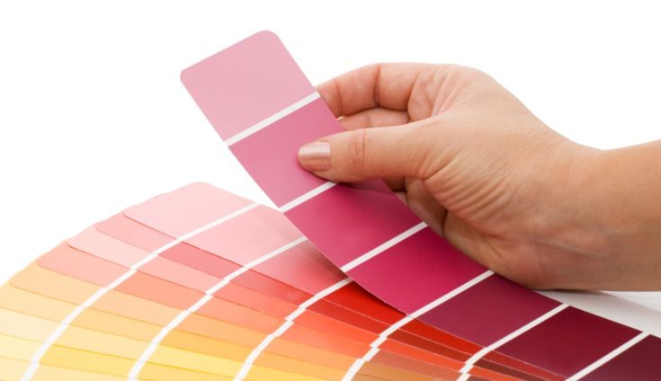
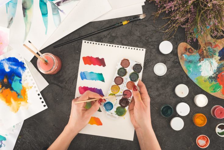
One of the most important aspects of being an artist is understanding and using color in your paintings. Unfortunately, mixing and selecting your own colors can be incredibly intimidating, especially if you’re a beginner or aspiring painter.
Color theory for painting is quite complex, but that doesn’t mean it has to be intimidating. In this guide, we’ll go over all the essentials you need in order to apply color theory effectively in your paintings.
What is Color Theory?
Color theory is the art and science of how colors interact to achieve different effects. The term encompasses a wide variety of related concepts and techniques, including color mixing, color harmony, and more scientific principles of colorimetry and optics.
The reason it is such an important part of the painting is that color plays such a large role in our moods and emotions. Have you ever looked at a blue painting, like Van Gogh’s Starry Night, and felt sad? Or felt drawn to an abstract painting without knowing why? That’s the color theory at work!
In order to use color as a tool for conveying meaning or expressing emotion, painters need to have a good understanding of what colors work well together, how many colors to use, and how to mix paint to achieve the perfect tone.
Key Terms
Before we begin, it’s important to understand a few of the key terms that you will come across when working with colors and mixing your own paints.
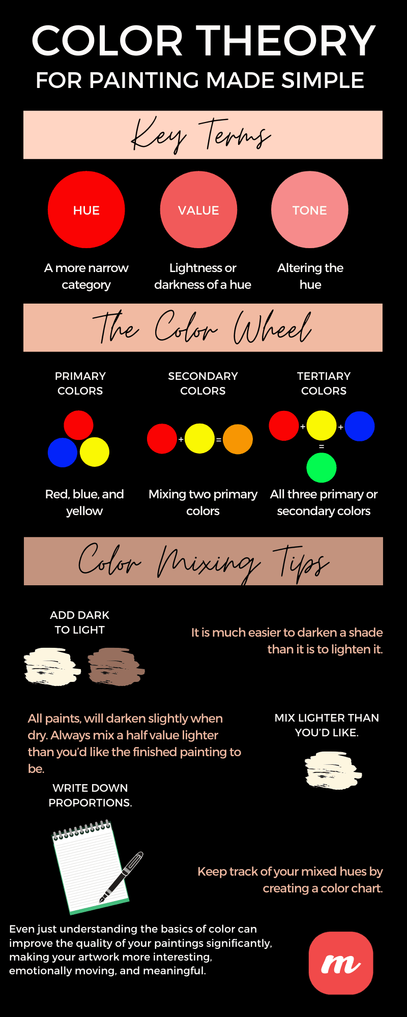
- Hue: Although hue and color are often used interchangeably, hue is typically a more narrow category. For example, we may think of colors in terms of blues and reds. In contrast, a hue may refer to a specific type of blue or red such as cobalt blue, ultramarine, or cadmium red.
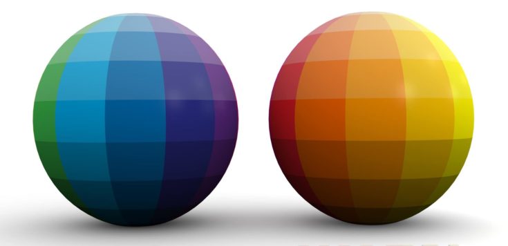
- Value: Value refers to the lightness or darkness of a hue. It is a term borrowed from drawing, where an artist might use a value scale to distinguish between light and dark shading achieved with the same pencil.
Different values of the same initial hue are referred to as shades and tints. A shade is achieved by adding varying amounts of black, whereas a tint is achieved by adding varying degrees of white. For example, adding black to a red hue would achieve a dark red shade, whereas adding white to the same hue would achieve a light red tint.
The important thing to note about value is that the hue remains the same throughout. A burgundy hue will remain burgundy whether it has dark or light value.
The important thing to note about value is that the hue remains the same throughout. A burgundy hue will remain burgundy whether it has dark or light value.
- Tone: Tone is perhaps the most misunderstood term in painting. The easiest way to think of it is that a tone is the result of adding both black and white to a hue. Rather than simply changing the darkness or lightness of the color, you are actually altering the hue further by desaturating it or making it less intense.
The importance of different tones is that they can reveal subtleties in the paint, create more realistic colors that reflect the brightness or dullness of everyday objects, and contribute towards the overall mood of a painting.
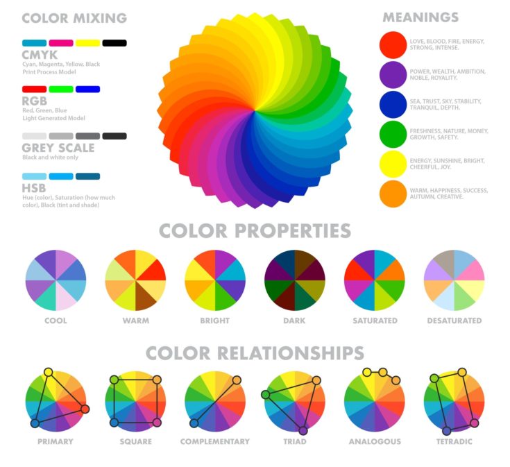
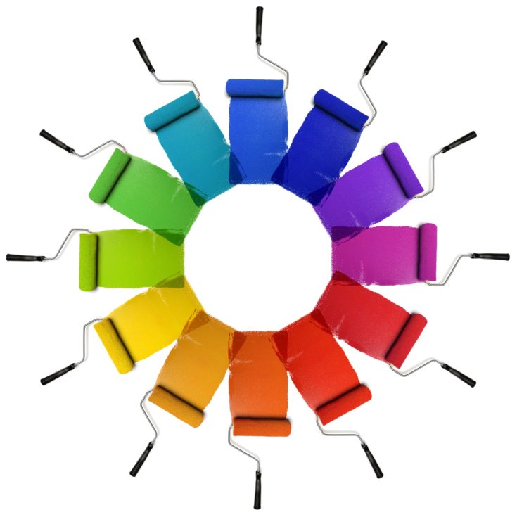
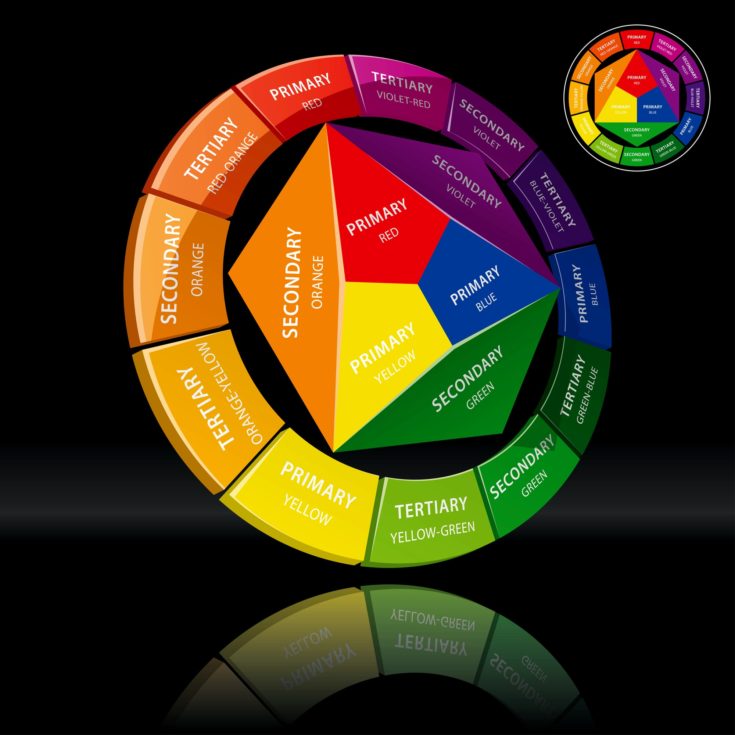
The Color Wheel
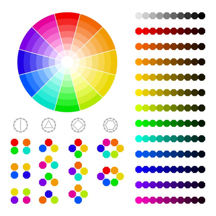
The color wheel serves as the foundation for all color theory in art and design. It was first developed by Sir Isaac Newton in the 17th century and has been an essential tool in every artist’s toolkit ever since.
A traditional color wheel consists of three primary colors, three secondary colors, and six tertiary colors arranged in a circular fashion in order of their appearance on the visual spectrum, creating a wheel with 12 distinct sections. Some color wheels break this down even further by adding more tertiary colors, but for now, we will focus on the fundamentals.
Black and white are typically not included in the color wheel. In painting, they are used to darken or lighten paint to achieve different shades and tints and are not usually considered a major part of color theory.
Primary Colors
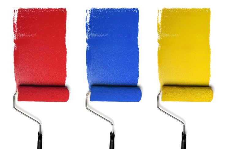
Primary colors are the three paint pigments—red, blue, and yellow—that cannot be formed by mixing any combination of the other colors. Any color on the visual spectrum can be obtained by mixing these three colors hues.
Each of the primary colors is shown to have a specific psychological impact on the viewer.
Red has the greatest impact and is associated with power, passion, and danger. It draws the observer’s eye more than any other color, which is part of the reason why so many popular brand logos feature red. Red focal points can create an impact in otherwise monochrome paintings.
In contrast, blue has a calming, soothing effect on the viewer, whereas yellow is associated with nervous energy and anticipation.
Secondary Colors
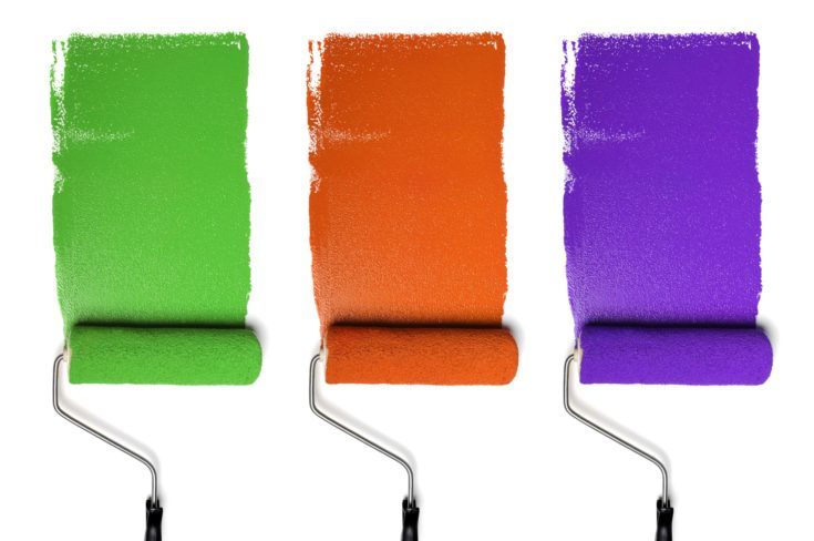
Mixing two primary colors together always results in one of three secondary colors. Blue and red combine to create purple; red and yellow make orange; and yellow and blue mix to obtain green.
While mixing yellow and blue will always produce some version of green, you can change the hue of the secondary color by mixing different types of blues and yellows and changing the proportions in which you mix them.
For example, mixing yellow with phthalo blue will produce a deep evergreen shade, whereas the same yellow with a cobalt blue will produce a much brighter lime hue.
Tertiary Colors
Tertiary colors are all the in-between hues like turquoise, grey, or brown that are made by mixing all three primary colors or any combination of primaries and secondaries.
When combining your own paints, be careful not to throw too many colors into the mix all at once. While it may be tempting to combine reds and oranges and blues to achieve that perfect magenta hue, mixing too much paint together will always result in muddied, dirty looking hues.
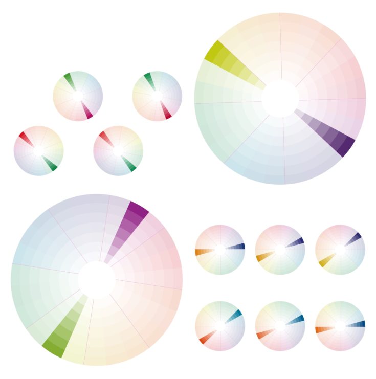
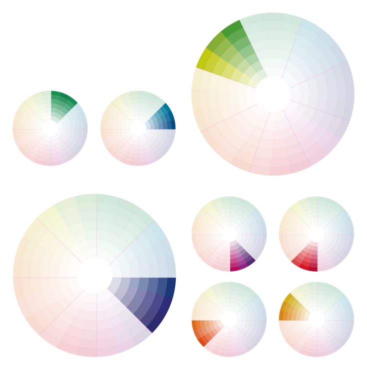
Color Harmony
Once you have a basic understanding of the colors that are available and how to create variation by incorporating various shades, tints, and tones, the next step is understanding how different hues interact and how to choose colors for your paintings.
Color harmony has to do with finding a color palette that is visually pleasing, engaging, and makes sense in terms of balance and desired emotional effect.
Here are a few examples of different color combinations and palettes that you can use to evoke emotion in the viewer:
Warm and Cool Colors
All colors can be classified as either warm or cool. In general, warm colors are those that consist primarily of reds and yellows, whereas cool colors are mostly made up of blues.
Some reds are warmer than others. For example, a burgundy color is cooler than a cadmium red but is still substantially warmer than an ultramarine blue. However, the general principle is that every hue leans either warm or cool.
One of the benefits of mixing your own hues is that you have a very good sense of the temperature, having observed the proportions of primaries that went into the mix.
Color temperature also plays an important role in the emotional impact of a piece. Warm colors denote energy and light whereas cool colors are associated with calmer emotions and even melancholy. Before you begin painting, decide whether you want to achieve a warm or cool effect and center your palette around these hues.
You can also experiment with warm and cool contrasts. A painting that contains both warm and cool colors will be more exciting and conflicting because the two temperatures clash.
Complementary
Complementary colors are those that are directly opposite each other on the color wheel. Placing two complementaries next to each other brings out the intensity in each, creating an extreme contrast that gives the painting vibrancy and power.
When working with complementary colors, be careful to limit the range of your palette. Too many complementaries used in one composition will be jarring and difficult to look at.
Instead, try selecting one dominant hue to inform the palette of your painting, and use its complementary color as an accent.
Analogous
While a complementary scheme produces an energetic effect, an analogous palette will make a painting look relaxing and harmonious.
Analogous colors are three or more colors that are directly beside each other on a color wheel, such as yellow, yellow-orange, and orange. You can use analogous colors that are either warm or cool, and this will contribute towards the overall mood of the piece.
When working with an analogous color combination, try picking one color to serve as the dominant color and a secondary color to provide depth. Use the third color more sparingly as an accent.
Triadic
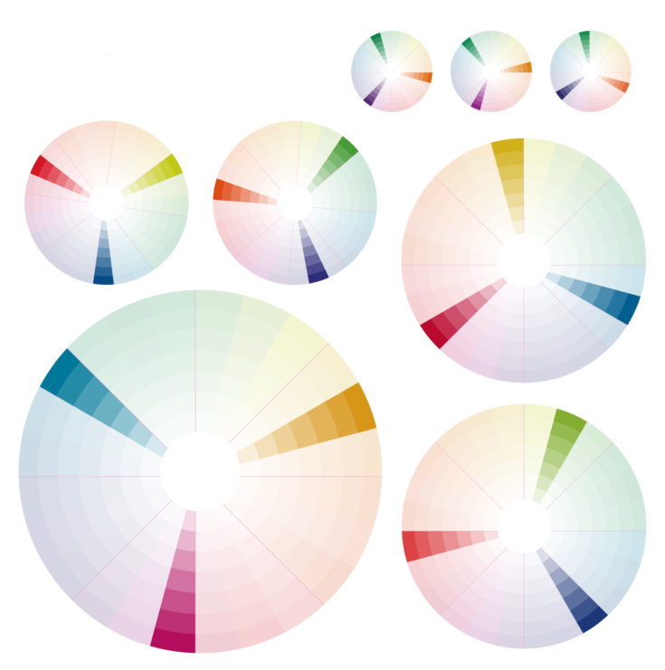
Triadic colors are hues that are equidistant on a color wheel. Triadic compositions can be further broken down into those that only use primary colors, and those that use secondaries or tertiaries. Triadic combinations result in the greatest vibrancy and are often used in graphic design and pop art.
When working with triadic color combinations, it is especially important to select one dominant color and use the others sparingly as accents. In order to ensure that your painting is still harmonious, it is important to make use of variations in tone and pay special attention to balance.
Tips for Choosing Colors
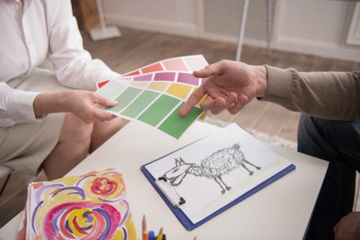
When selecting colors for painting, you want to consider not only how the colors interact and what color palette will achieve the right mood and emotion, but also the way colors manifest in the real world!
When painting based on a specific subject, you’ll want to carefully consider the colors that appear in the subject. Observe the natural colors and then decide which ones you want to emphasize or if you want to impose a scheme that does not appear in the subject at all. Much of color harmony is just experimenting and using color with a purpose.
Color Mixing
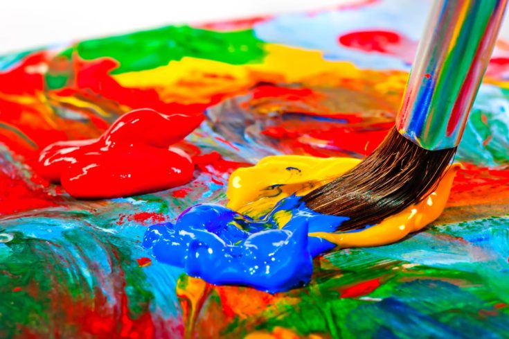
Finally, color theory can be applied to mix paint and create unique shades. Color mixing may seem like a very difficult task, especially when there are just so many options for buying premade hues in just about any shade, tint, or tone you can think of.
That said, practicing color mixing is a great way to enhance your understanding of color theory and ensure that you have full control over the colors you use. You’ll finally be able to get that exact, perfect shade of blue you’re looking for in your ocean scene.
The only time you may want to consider purchasing a ready-made tube is if you are planning on using a lot of one color or painting graphic art that requires highly intense colors like bright pinks and saturated oranges.
Mixing Tints
Earlier we established that shades and tints are darker and lighter versions of hues achieved by adding black or white. Although this is still true in definition, it is something of an oversimplification.
In practice, white and black are rarely used in fine art. In fact, many famous artists swore to never use black when mixing hues or painting. This is because black almost never occurs in nature and when mixed into paint, it adds murkiness and muddles the hue rather than simply adding darkness.
Similarly, white reduces the vibrancy of color as it lightens it. When you add white to primary colors, you often end up with pastel versions of the hue as opposed to a lighter color value. For example, adding white to red will produce a cool, opaque pink rather than a lighter shade of red.
One solution is to use small amounts of yellow or yellow mixed with white to lighten warm colors. Be aware that watercolors are much different from acrylics and oils. With watercolors, simply add water to lighten the paint. Because the paint is transparent, more water will enable more of the paper to show through, creating a lighter tint.
Mixing Shades
To create shades, try darkening colors with blues and purples. This will prevent the hue from becoming flat and dull while simultaneously adding more dimension to your painting. If you plan on using black in your painting directly, experiment mixing your own blacks out of dark blues, browns, and reds.
In nature, shadows are never purely black, nor are they a darker version of the subject. Shadows regularly contain traces of complementary color or various shades of blue. Practice observing the shadows you see in everyday life to improve your ability to recognize shades. This will really enhance your paintings.
How to Mix Brown
Brown is one of those colors that are sometimes hard to spot on the color wheel. That’s because pure brown is actually made up of all three primary colors and is thus a tertiary color that leans more red, blue, or yellow depending on how it is mixed. This can add tremendous depth and complexity to an otherwise simple painting.
To mix brown, begin by mixing each primary color with its complement. Add orange to blue for a cool brown, purple to yellow for a light brown, and green to red for a warm brown. Continue experimenting with the three primaries and their secondaries until you’ve found a brown that you like.
How to Mix Grey
Grey does not appear on the color wheel at all because it is a mixture of white and black. However, it is rare that you will use pure grey as this is not a color that appears in the natural world.
Instead, you’ll want to mix deep earth colors such as tertiary blue-greens and browns with small amounts of white. Many paint brands have online tutorials for mixing colors, so if you’re struggling, you can always turn to these resources for help.
Color Mixing Tips
Here are a few pro tips for mixing paints:
- Add dark to light. It is much easier to darken a shade than it is to lighten it. If you want to achieve a light blue, start with a small dollop of white and slowly add tiny amounts of blue to the mix. By darkening lighter colors rather than the other way around, you’ll save yourself a lot of paint.
- Mix lighter than you’d like. Oil paint famously oxidizes over time, darkening and yellowing with prolonged air exposure. However, all paints, including acrylics and watercolors, will darken slightly when dry. When you are mixing hues, always mix a half value lighter than you’d like the finished painting to be.
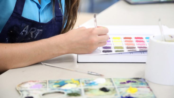
- Write down proportions. Because color mixing is all about trial and error, you’ll want to keep track of how much of each primary or secondary color is going into each mix. You never know when you’ll achieve that perfect fuschia pink or mouse grey or olive green and need to recreate it later.
This is also good practice for large scale paintings that will require you to either mix paint in large batches or know how to accurately re-mix certain hues. One of the best ways to keep track of your mixed hues is by creating a color chart.
Conclusion
Color theory is an essential tool for beginner and professional painters alike. Even just understanding the basics of color can improve the quality of your paintings significantly, making your artwork more interesting, emotionally moving, and meaningful.
Once you’ve got a good grasp of the basics of color theory, you’ll find yourself noticing and appreciating color more in your day-to-day life.
What do you think of this guide? Let me know what you think in the comments and be sure to share this article with all of your fellow painters. On the other hand, interested in hardboard or wood painting? Check our article here.
Also check out our article on fresco painting.