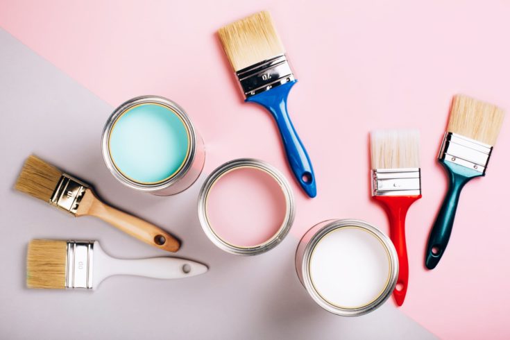
How magnificent is the world of colors? Have you ever stopped to consider how life would be like if you were colorblind? Or what the world would be like if everything was black and white? But the colors are so much more complicated than distinguishing pink from coral: it’s also about hues, tints, tones, and shades; all of which are terms that can get very confusing.
What Is Color Therapy?
If you ever sat down to think about it, colors have a great impact on our state of mind, how we feel and how we perceive the environment around us. But have you ever stopped to consider that colors can actually be a form of emotional therapy?
Color therapy has a very specific goal: to correct psychological imbalances, such as stress or depression. It goes way back to Ancient Egypt, when people used to think that light and colors have a powerful healing property. Even if Western practices are still skeptical about the benefits of color therapy, it is still something that’s being studied and even practiced in certain spa retreats.
A great part of color therapy is the creed that suggests colors can change a person’s mood. There are seven main colors used in this particular type of therapy, but it’s important for the color therapist to know which want to choose depending on each individual.
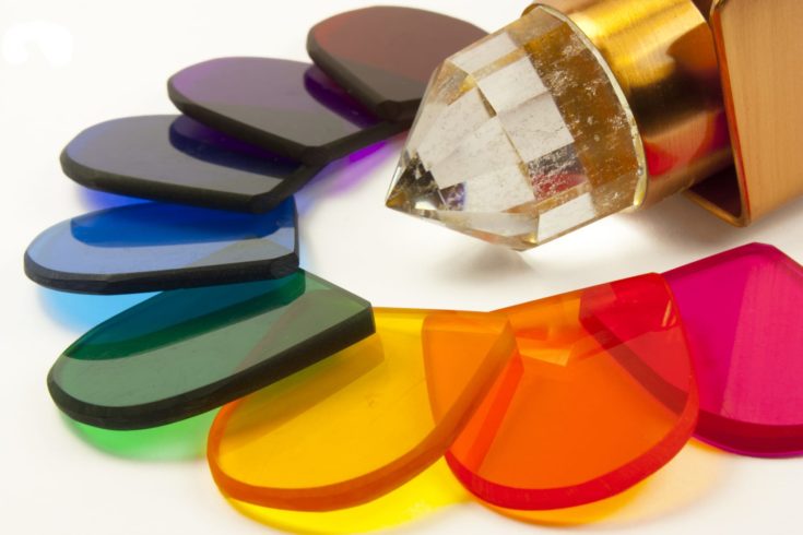
How does this work, exactly? Well, light frequencies are being delivered to your eyes, via special equipment. This equipment will project specific colors on a screen, while you look at it. Of course, those who don’t have this type of equipment suggest simply staring at a color for a few minutes. Depending on which color you’re looking at, your mind can shift to different states:
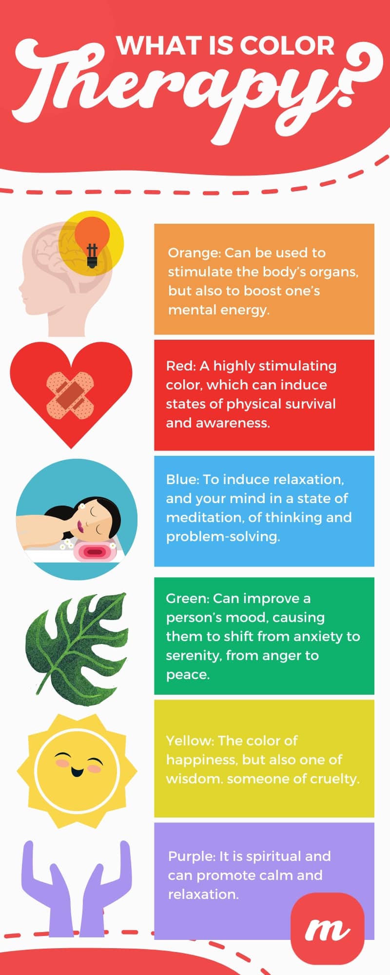
- Orange: There’s very much symbolism revolving around the color orange. There’s sexuality, well-being, and pleasure. As part of color therapy, orange can be used to stimulate the body’s organs, but also to boost one’s mental energy. It’s a color suitable for mediation because it helps the mind connect with the rest of the body, making one more aware of the presence of the other. However, it’s a color best avoided by people who suffer from anxiety.
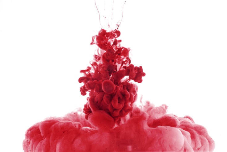
- Red: If orange and red were a high-school pair of bubbies, red would be the troublemaker. It is a highly stimulating color, which can induce states of physical survival and awareness. It is believed that red can have major emotional effects, so it’s mostly used to stimulate the body, causing great agitation. It’s a color that you want to avoid if you’re in a really bad mental state.
- Blue: Blue is a very special part of color therapy, because it is believed to be able to amplify emotions. Whatever you’re feeling at the time, blue will make it more intense. It’s a color meant to cause the need for expressing feelings, but also a color of self-reflection. Blue is part of color therapy to induce relaxation, and your mind in a state of meditation, of thinking and problem-solving. It is a spiritual color, often associated with creativity, but also loyalty. Blue can help treat insomnia, but too much blue can lead to states of depression.
- Green: Believed to be the most balancing of all colors, green is all about peace. In fact, there are plenty of color therapists that choose to start with the color green. Green can improve a person’s mood, causing them to shift from anxiety to serenity, from anger to peace. It promotes love and joy, and it gives people a state of inner peace. It’s also said that green causes people to strive to be more independent, and promotes the idea that change is sometimes welcome.
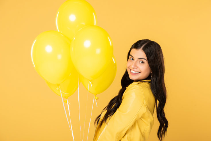
- Yellow: Yellow is the color of action, and it’s greatly used in therapies designed for people who feel uncertain, and are having a hard time to make a decision that they find to be very important and emotionally charged. Yellow is the color of happiness, but also one of wisdom. However, bright yellow can induce a state of agitation, and cause the need for revenge or remind someone of cruelty. It is also the most intense color in the spectrum.
- Purple: Despite its beauty, purple is a very straightforward color. It is spiritual and can promote calm and relaxation. Often times, purple is projected onto one’s neck and forehead, but it can be used on any part of the body.
We wanted to explain what color therapy is before proceeding to the actual subject at stake because only by understanding the power of colors will people be motivated enough to see how they combine, and how the primary and secondary colors can actually lead to such an impressive palette of results. Read more here on art therapy exercises.
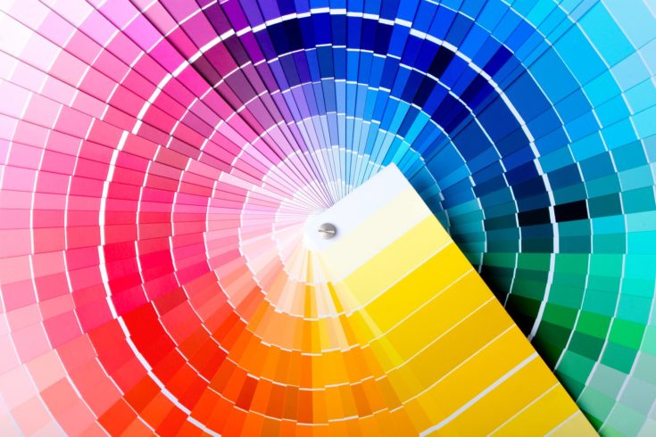
Color-Related Terminology
When it comes to colors, there are plenty of terms that one can find confusing, such as the ones we plan to talk about next.
- Tint: When you add white to a specific color, you will increase its lightness level, and that is called a tint.
- Shade: When you add black to a specific color, you reduce its lightness, and that’s called a shade.
- Tone: Tone is a product of mixing a specific color with grey, or by shading and tinting.
- Hue: The hue is the color itself. Whether tinted, shaded, or toned, the hue of color stays the same.
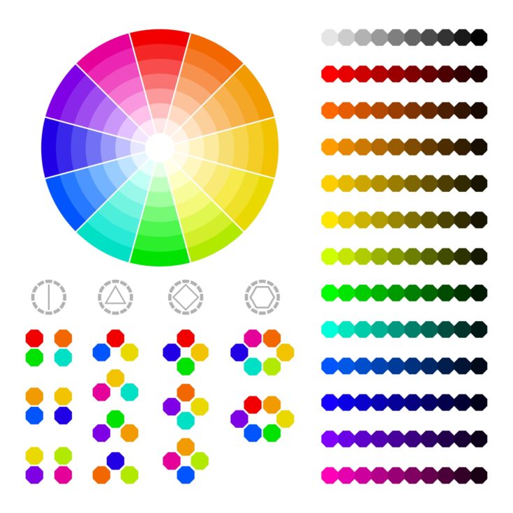
There are plenty of people that confuse the terms of hue and color, and it’s perfectly understandable if you are one of them. Explaining the difference between the two can be a little difficult, but let’s give it a shot.
Color is a general term that brings together all the other terms. It is hue, tint, shade, and tone, regardless of the combination. Colors include even those we perceive to be non-colors, such as black, white, or gray.
Hue, on the other hand, is the dominant color of one color family. When you think about hue, try to picture only the primary and secondary colors (which are the combinations made between two of each of the primary colors). What hue actually means is the base of the mixture.
When you take a base color and mix it with a certain amount of white, you get a tint. Tint makes a certain color lighter, but it doesn’t make it brighter, even if, at first glance, it appears so. When you add tint to color, the result you get is the exact same color, only in a paler version of it. What tint basically does is to alter the value of a color.
As opposed to tint, mixing a true color with a certain amount of black will lead to a shade. A shade is basically a darker version of a hue or color. The basic color remains the same, only you get a darker version of it. This means that the end result can be anything from a slightly darker shade all the way up to pitch black.
When you combine black and white, the resulting neutral color is gray. Adding gray to a color or hue will result in a tone. In other words, tones are colors combined with both black and white. Regardless of the quantity of gray that you add to a color, you will change its intensity.
Even if tones colors are perceived as being more pleasant, adding too much gray to a color will dull it way too much, up to a point where it becomes harder to showcase its brilliance.
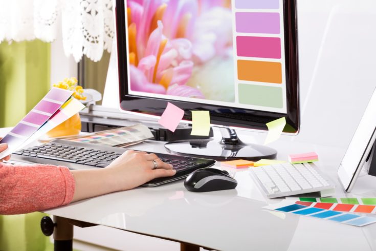
Graphic Design Applications
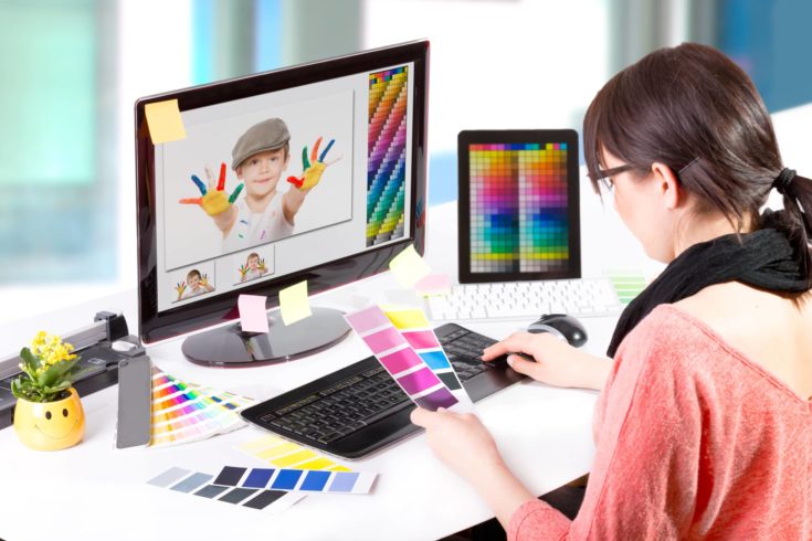
If you work in graphic design and aren’t quite sure how this knowledge can be put to good use, let’s talk about some inspiration for your future projects:
- Those of you that work in branding will have to create plenty of logos throughout your entire career. When you use tints and shades of a single color, you can create logos with a very unified look. This way, you can reinforce the visual identity of a company.
- In graphic design, you will face the concept of contrast a lot, but you might not be sure at first why you should master it. Contrast lies at the basis of easy navigation, so think about the massive visual effects you can obtain when you mix dark shades and light tints of the same color.
- Tints and shades are very useful when you want to separate the elements of your visual design. Think about a poster: how easy would it be if all the elements depicted on it were of similar tones, saturation, and colors? The separation technique will come in handy when you have to create materials that contain a lot of different elements, with plenty of information that the viewer has to clearly separate in order to get the bigger picture. Cluttering is one of the worst things you can do when you’re a visual designer, so make sure that you don’t overwhelm people with too many colors.
- When tints and shades work together, you can create both depth and dimension in your works.
- Remember how in the first part of the article we talked about the colors’ abilities to induce a certain mood? Colors play a major role in making people feel a certain way. That’s something that graphic designers should take advantage of.
- If you want your shades and tints to have a further effect, consider using gradients. These are subtle changes in your colors that actually create the illusion of having added more color.
Conclusion
Colors are intriguing, to say the least. They are extremely powerful and can induce certain moods and even change someone’s state of mind or spirit. However, colors have to be used correctly, and not just when dealing with color therapy. In marketing, sales, branding, arts, and plenty of other fields, color plays a major role in getting people to feel a certain way, to remember a specific logo, and can really shift one’s mentality in relation to a product, a service, or the brand itself.
Explaining the concepts of colors, hues, tints, tones, and shades is the first step in understanding more about how colors work and how they combine together to create all sorts of masterpieces. So, whether you’re a graphic designer, an interior decorator, a merchandiser, or a painter, these concepts will help you expand your color-related knowledge and help you see why the world isn’t all black and white.
Want to level up your drawing skills? Click here for exercises you can use to improve.